
Warm or cool? Making sense of neutral exterior colors
 Loading house image…
A simple comparison exercise can help you narrow down whites, grays, and taupes.
Give each neutral a neighbor
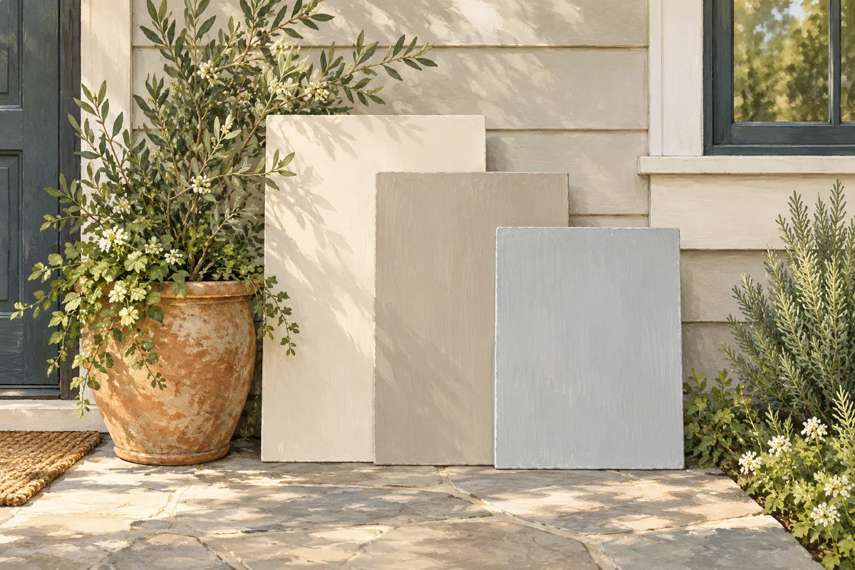
A neutral that looks balanced on its own can feel different beside another color. Lay a warm cream, a soft gray, and a taupe beside one another rather than trying to judge each from memory.
Describe what you see in plain terms: warmer, cooler, greener, pinker, or softer. You do not need to assign a perfect label to make a useful comparison.
Bring the fixed finishes into the conversation
Carry your shortlist to the actual house. Hold the samples beside the masonry, window frames, and roof materials that will remain. The goal is a combination you enjoy, rather than making every element match.
If one option feels distracting beside several permanent finishes, set it aside. Reducing the shortlist is useful progress even before a final favorite emerges.
Make one decision at a time
Start with a body-color direction, then compare trim options with that finalist. Changing body, trim, roof, and door simultaneously makes it difficult to understand which change improved the palette.
Save a record of each comparison. A small number of clearly named options is easier to discuss with a partner, painter, or community reviewer than a large pile of nearly identical chips.